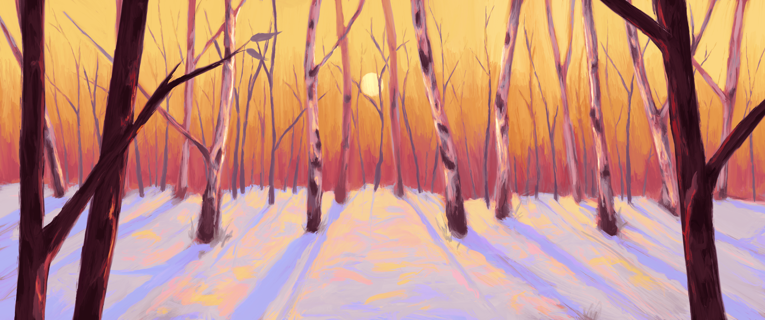
Background Painting
I served as the art director and background painter for the 2D Animated Short Film Pushing Up Daisies. The film has won awards for art direction, including character design and color design.
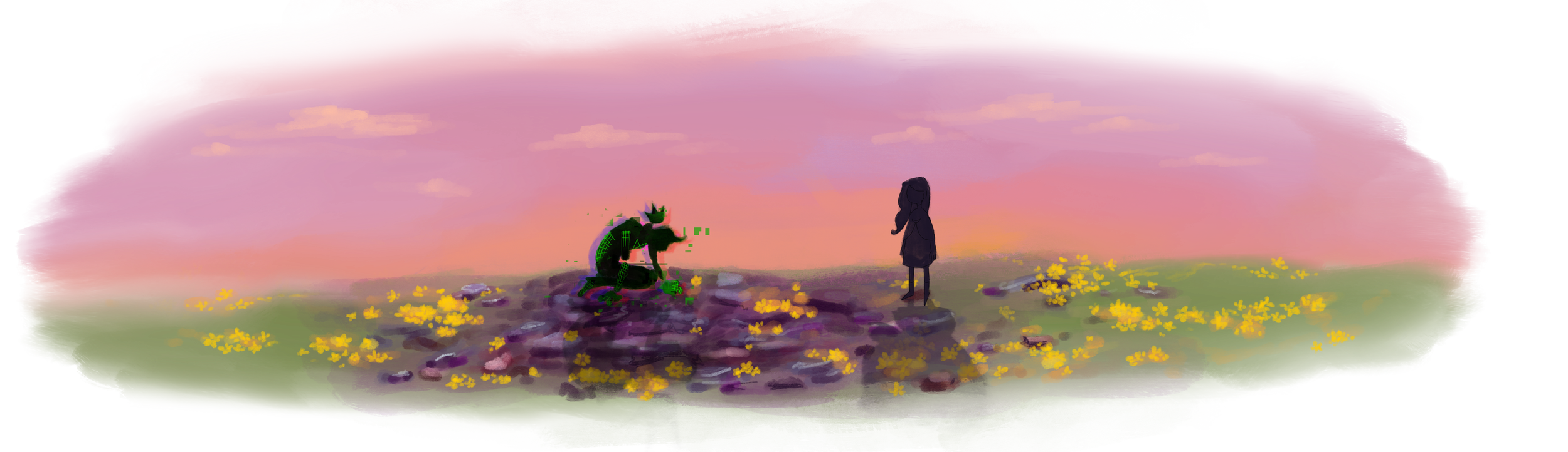
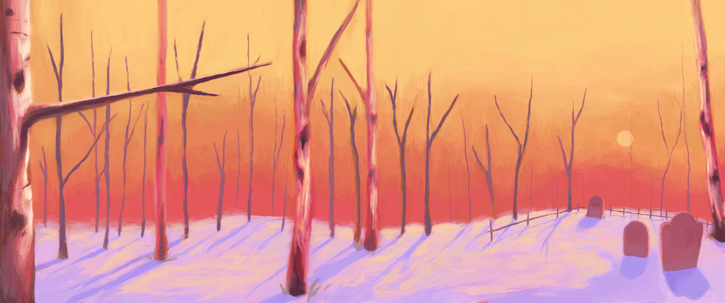
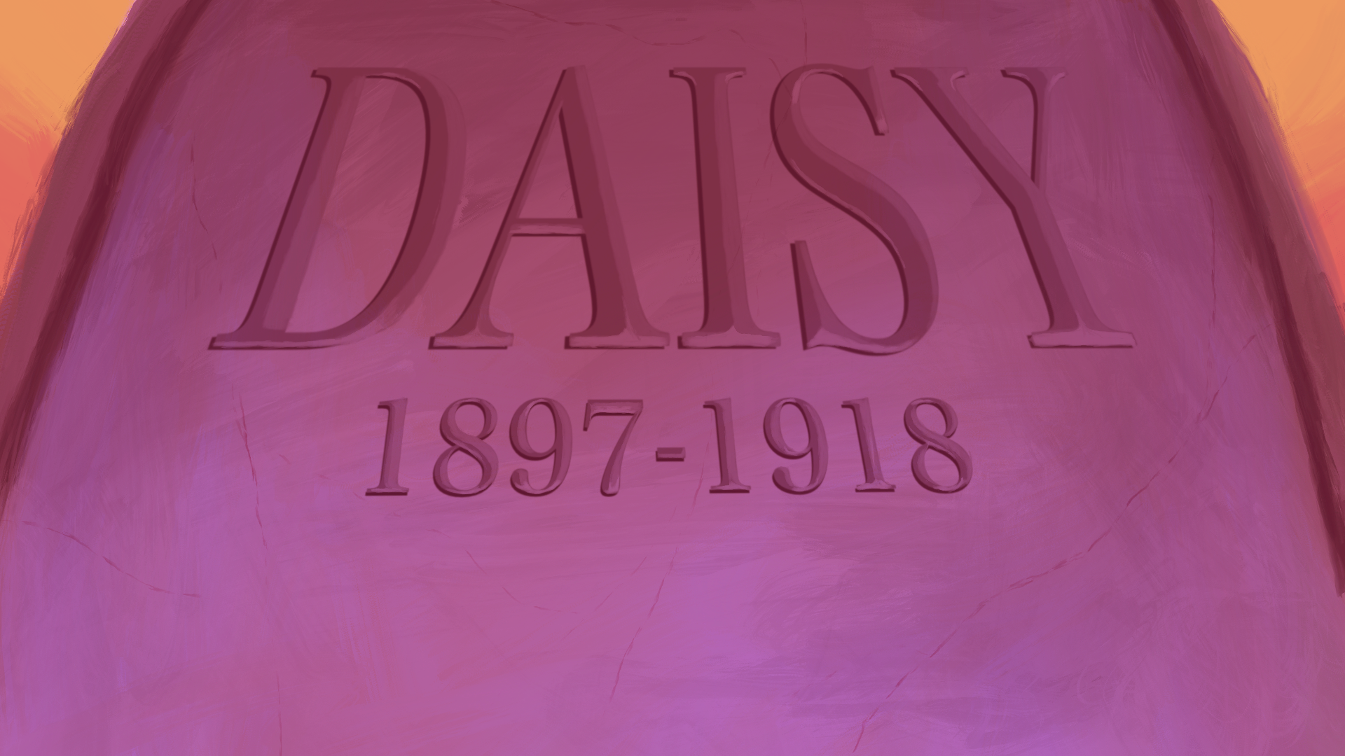
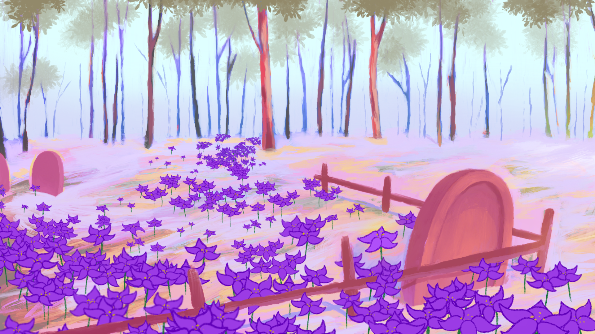
The film’s backgrounds transition from a winter forest sunrise to a midday spring forest. The colors represent the main character’s personal growth; Daisy begins as a ghost obsessed with maintaining her connection to life; her existence represents an in-between state of life and death, like how a sunrise marks the point between night and day. As she learns to accept her situation, the sky commits itself to the day and the season changes to spring. As the forest begins to teem with life, she recognizes how death and life intertwine and allows herself to rest.
I landed on a very painterly style for the backgrounds of this film because I felt it best reflected the organic feel and beauty of nature. I was also trained in traditional painting techniques and appreciate the textured feel of real paint, so I wanted to reflect that quality through the digitally painted backgrounds of this film. I have a deep appreciation for color and color theory as well, so I wanted to make sure the colors of this film worked together and popped nicely while also reflecting Daisy’s colorful view of the nature around her.
The flowers in this film were drawn in the same 2D line art style as Daisy. While this was mostly done for animation purposes, this stylistic difference also reflects Daisy’s narrative connection to the flowers in her journey of coming to terms with her mortality.
Visual Development
Character Design

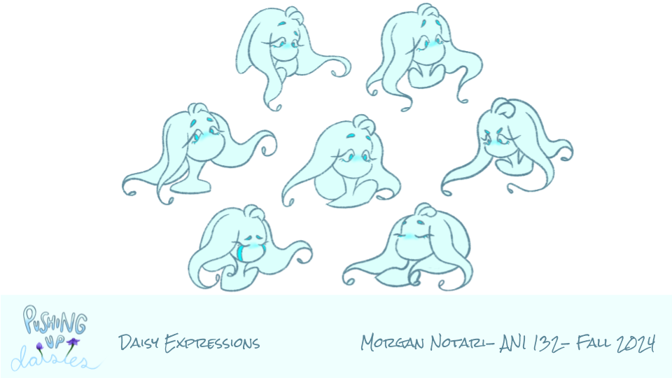
Daisy
Pushing Up Daisies
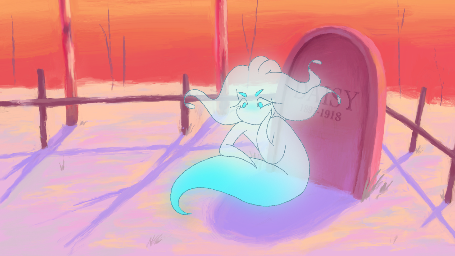
Daisy is the main character of the 2D Animated Short Film Pushing Up Daisies. She is a lingering ghost who is obsessed with the living and unable to accept her own mortality. When designing Daisy, I wanted to strike a balance between her ghostly nature and her innocence; she needed to look supernatural but also have features that made her visually appealing. I gave her big, expressive eyes to reflect her obsession with observing the life around her, but intentionally left her without features like a mouth to make her look slightly off-putting and to reflect how she no longer has a say in the world around her; I drew from Japanese Kawaii character designers to balance her cuteness with her supernatural features. The simplicity of her design has both a story and production purpose- from a story standpoint, she is the essence of a person who used to exist, so her design reflects the simplicity of a soul. From a production standpoint, her simplicity and clear arcs/curves make her very fast to animate, which was essential for speeding up animation production. Making her silhouette unique was very important to me- her overall design and shape language is meant to resemble the flower petals we see in the film to represent her connection to the flora. Daisy’s coloration also changes throughout the film- when she’s content, her gradient is a bright cyan like in the turnarounds, and when she’s sad, her gradient turns to a light, pale blue.
**This film is still actively in the pre-production/pitch phase. More artwork of this character and film stills will be added as they are created.
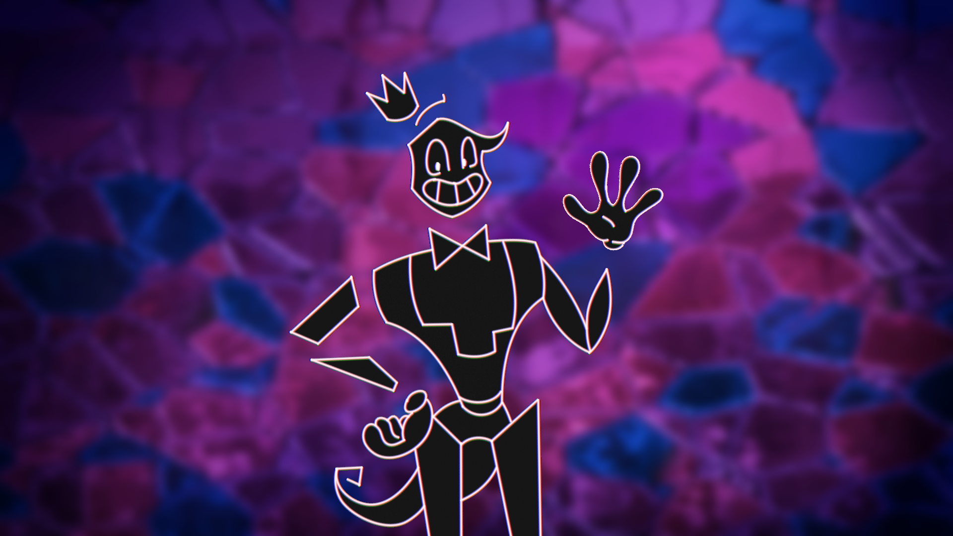
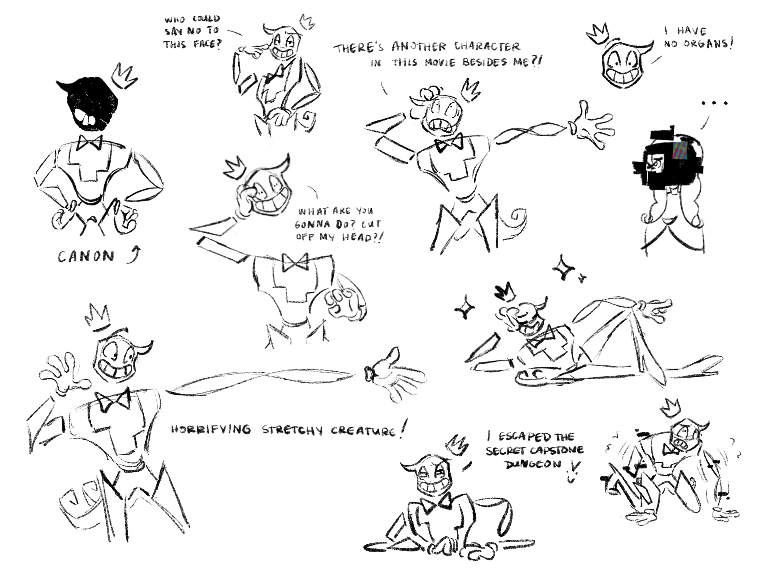
The King
Defection
The King was a very interesting character to design because of the rules of the world this film takes place in. In the weird, digital world of Defection, The King has complete and total control over every aspect he’s created, including his own appearance- meaning canonically, he designed himself. This presented an interesting challenge going into character design because I needed to think about which features he would include and which he would choose to omit, and overall needed to consider what he would want to look like from an aesthetic standpoint.
Over anything, The King wants to look unique and marketable- he wants to have an “iconic” cartoon character kind of look with an instantly recognizable silhouette and simple charisma. I landed on a very abstract, shape-heavy design, which serves both narrative and production purposes. From an animation standpoint, his disjointed and simple design lends itself very well to rubber hose style animation, which is exactly what we wanted for this character who bends the rules of reality.
From a narrative standpoint, this character is a man who has completely lost himself in a digital world that gives him everything he wants whenever he wants it. His coloration of chromatic white line with black fill represents his altered digital state and his personality; he is a black hole who sucks in everything around him. His literal disjointed nature represents his mental state and disconnection from reality. His features also represent his vulnerabilities- his lack of a neck reflects his intentional leaving-out of that vulnerable spot (especially as a “royal”…no neck means no guillotine if things go wrong.) His gloves, while they add to his “iconic cartoon character-ness”, also reflect his fear of germs and being touched. And his ever so iconic smile, which he forces everyone to wear, reflects a masking technique. Even while speaking, his jaw never opens- he says it’s because he likes to smile, but in reality, he’s so stressed about maintaining control over every piece of his world that his jaw is locked from the pressure. Don’t tell him I told you that though!